Powering Dash Apps with BigQuery
Dream big, query bigger

Will Carhart
Will Carhart

A primer on Plotly and Dash
It's an average day as a software engineer during COVID-19. You said last night you'd be up by 8am but it's 8:30am and you're still in bed. You make sure to check Slack on your phone so your co-workers think you're online despite the fact that the covers are pulled up to your nose. At 8:57am, you groggily roll out of bed for your 9am Zoom standup and put on the same sweatshirt from yesterday you left wadded on the floor. While someone drones on about semicolon rules in the repo's .eslintrc you hop on Reddit and browse r/DataIsBeautiful. You're now awake gazing wide-eye at the beautiful visuals other software engineers and data scientists are creating. Someone made an interactive voting map for the US down to the city. Someone else made a COVID-19 tracker, with a cool demo video. How do they make all this stuff so quickly?
The answer is Plotly and Dash. Built atop D3.js and stack.gl, Plotly is a high-level, declarative charting library. Combined with Dash, a productive framework for building web analytic applications with highly custom user interfaces in pure Python atop of Flask, Plotly.js, and React.js, it's possible to rapidly develop complex, reactive web apps with ease.
Let's take a look at how we can build a powerful app from scratch using Plotly and Dash and data from GCP BigQuery.
Building charts with Plotly
The word "Plotly" is a bit ambiguous due to how Plotly has evolved over time. Initially Plotly.js, Plotly has developed a wide variety of visualization and data science related tools. Plotly is the name of the company behind the library, as well as the open-source library itself. It has graphing libraries for JavaScript (Plotly.js), Python, R, Julia, and more. For the rest of this article, when I mention Plotly I am talking about the Python Plotly library, unless otherwise noted.
Plotly is a mature, fully-featured library and can seem complicated to dive into. That's why Plotly (the company) created Plotly Express, a terse, consistent, high-level API for creating figures. Let's get started with the Dash and Plotly ecosystem with Plotly Express.
First, we'll need to install Plotly (and for Plotly Express, we'll also need pandas). Let's do some housekeeping beforehand to prepare.
Note
I'm not going to cover pandas in depth because it's out of the scope of this article. If you haven't heard of it before, pandas is a super powerful data science-oriented library in Python. To get started, check out some of the tutorials on pandas' website.
python3 -m virtualenv -p `which python3` venv
source venv/bin/activate
python -m pip install pandas
python -m pip install plotly
Next, let's use one of Plotly's dummy data sets to create a figure. For this example, we'll be using Plotly's GDP per capita vs. life expectancy dataset, an interesting relationship to study (but that's beside the point). Let's create a new file called fig.py.
import plotly.express as px
df = px.data.gapminder()
fig = px.scatter(df.query('year==2007'), x='gdpPercap', y='lifeExp', size='pop', color='continent', hover_name='country', log_x=True, size_max=60)
fig.show()
Now, we can run our app with python fig.py, which should open a new tab in the browser to display the generated figure.
GDP Per Capita vs. Life Expectancy
Pretty cool, right? Before we go any further, note that any Plotly figure comes out-of-the-box with some neat controls. Use the toolbar in the top right of the figure to zoom, box select, lasso select, download the figure as a PNG, and more. Here's what that toolbar will look like.

Use the Plotly toolbar to interact with generated figures.
Now, let's break down what we just built.
The first line import plotly.express as px just imports Plotly Express from where Pip installed it. It's standard to call Plotly Express px for brevity.
Next, we create a pandas dataframe, the standard data structure for pandas, from Plotly Express' test data set, which we instantiate with px.data.gapminder(). If you're curious, the data in the Gapminder dataset comes from gapminder.org.
Then, we use our dataframe to create a new figure. There are many different kinds of figures we can create with Plotly Express. For this example, we're using px.scatter, but other common Plotly figures are px.bar, px.line, and px.area. For the complete list, see the Plotly Express documentation. Plotly Express is nice because it gives us a single entrypoint into Plotly, and thus px.scatter can be configured in many different ways, which we control by which parameters we pass into its instantiation. For instance, let's change our third line to the following.
fig = px.scatter(df, x="gdpPercap", y="lifeExp", animation_frame="year", animation_group="country",
           size="pop", color="continent", hover_name="country", facet_col="continent",
           log_x=True, size_max=45, range_x=[100,100000], range_y=[25,90])
Run our code again and we'll see that the figure has changed dramatically, even though we're still using px.scatter.
GDP Per Capita vs. Life Expectancy, grouped by continent, animated by year
Finally, our last line fig.show() creates a Flask server to serve the figure, and then tears it down as soon as the figure is rendered in the browser. As we can see, we can build powerful figures easily with just Plotly alone, but what if we want them to update dynamically? Next, let's take a look at Dash and see if we can turn our static figure into a reactive web application.
Creating responsive web apps with Dash
You may have noticed that in the last Plotly example, the figure was already fairly interactive. You can move the slider below the graph to interact with the figure in real-time. So, what does Dash provide that Plotly does not?
Dash allows you to create a web application to showcase your figures without writing any HTML, CSS, or JavaScript. It abstracts away all the web related details that often weigh down data scientists and application developers. Let's discuss the anatomy of a Dash app and create a simple example.
First, let's talk about what a Dash app actually looks like. The simplest of Dash apps can be a single Python file, with a few elements:
- an
app.layout()declaration, which sets up the app's visual structure and layout (this is sometimes included in amainfunction) - any number of callbacks using the
@app.callback()decorator to run when something is triggered in the UI (e.g. a chart element is clicked or hovered)
First, let's install Dash. Make sure you're using the same environment from above, as we'll still need Plotly and pandas installed.
python -m pip install dash
Let's start with a basic skeleton for our Dash app. Create a new file called app.py.
import dash
import dash_html_components as html
from dash.dependencies import Input, Output

app = dash.Dash(__name__)

app.layout = html.Div([
    html.H1('Hello, Dash!', id='app-title'),
    html.Button('Change title', id='change-btn', n_clicks=0)
])

@app.callback(
    Output('app-title', 'children'),
    Input('change-btn', 'n_clicks')
)
def update_graph(n_clicks):
    if n_clicks % 2 == 0:
        return 'Hello, Dash!'
    return 'Hi there! Thanks for updating the title!'

if __name__ == '__main__':
    app.run_server(debug=True)
In your browser, navigate to localhost:8050. When you click the button, the title message will toggle. We made this all in Python, with no HTML, CSS, or JavaScript!

Our simple Dash app so far.
Let's break down our app so far.
The first few lines are setting up Dash. We import Dash and its components, and then instantiate our app with dash.Dash().
Next, we define the HTML layout for our app with app.layout. We do this with Dash's HTML classes in dash_html_components. In our example, our app has one div containing an h1 and a button, which we declare using html.Div(), html.H1(), and html.Button().
To enable our button's functionality, we use a callback. Callbacks are key to any Dash app's logic and are defined with the decorator @app.callback(). In the decorator, we define the inputs and outputs of the callback using dash.dependencies.Input and dash.dependencies.Output.
The Output is what the callback will return. This can be an HTML element, a Plotly figure, or just a simple value like a string or integer. In our example, we use the syntax 'children' when defining the Output to indicate that the value this callback will return is an HTML element or set of elements, which will be the children of the targeted component. The Input is what will trigger the callback. In most cases, this is some kind of input device, like a button or text input field. In our example, we're using a button. The syntax n_clicks=0 in our app.layout button definition acts a counter for how many times our button has been pressed. Because we registered one Input in our callback, the callback function takes one argument, n_clicks. To attach our callback to specific HTML components in our app.layout, we use the associated IDs. As you can see, we gave our h1 the ID app-title and our button the ID change-btn. We use these IDs in our callback to attach to these elements. Finally, the actual logic of the callback is fairly simple; we toggle between the two title messages every time the button is pressed.
Note
The n_clicks in def update_graph(n_clicks) is a user-named parameter, meaning we could name it whatever we want. On the contrary, the n_clicks in Input('change-btn', 'n_clicks') is a Dash keyword, which means to the number of times a button has been pressed. There are a certain set of keywords that refer to how input is passed to callback functions, like value, options, n_clicks, and more. To learn more about Dash callbacks, check out the documentation.
Then, to run our app we use app.run_server(). Using the option debug=True will enable hot-reloading so the app is automatically refreshed when a code change is detected.
Now, let's add some Plotly figures and try to make them interactive using Dash. As with Plotly, let's use a real dataset to make this interesting. We'll use the example country data from Plotly's open source datasets. First, let's set up our app so it can use Dash, Plotly, and pandas.
import dash
import dash_core_components as dcc
import dash_html_components as html
from dash.dependencies import Input, Output
import plotly.express as px
import pandas as pd

external_stylesheets = ['https://codepen.io/chriddyp/pen/bWLwgP.css']
app = dash.Dash(__name__, external_stylesheets=external_stylesheets)

df = pd.read_csv('https://plotly.github.io/datasets/country_indicators.csv')
available_indicators = df['Indicator Name'].unique()
We've added external_stylesheets to give our app some simple CSS styling, and we've read the example country data into a pandas dataframe. Recall that the easiest way for Plotly to generate figures from data is using pandas dataframes.
Next, let's beef up our app.layout a bit so we have some more components to work with.
app.layout = html.Div([
    html.Div([
        html.Div([
            dcc.Dropdown(
                id='xaxis-column',
                options=[{'label': i, 'value': i} for i in available_indicators],
                value='Fertility rate, total (births per woman)'
            ),
            dcc.RadioItems(
                id='xaxis-type',
                options=[{'label': i, 'value': i} for i in ['Linear', 'Log']],
                value='Linear',
                labelStyle={'display': 'inline-block'}
            )
        ],
        style={'width': '48%', 'display': 'inline-block'}),
        html.Div([
            dcc.Dropdown(
                id='yaxis-column',
                options=[{'label': i, 'value': i} for i in available_indicators],
                value='Life expectancy at birth, total (years)'
            ),
            dcc.RadioItems(
                id='yaxis-type',
                options=[{'label': i, 'value': i} for i in ['Linear', 'Log']],
                value='Linear',
                labelStyle={'display': 'inline-block'}
            )
        ],style={'width': '48%', 'float': 'right', 'display': 'inline-block'})
    ]),
    dcc.Graph(id='indicator-graphic'),
    dcc.Slider(
        id='year--slider',
        min=df['Year'].min(),
        max=df['Year'].max(),
        value=df['Year'].max(),
        marks={str(year): str(year) for year in df['Year'].unique()},
        step=None
    )
])
Woah, a lot has changed in app.layout! Now, we've added a few more HTML elements, but we've also added some Dash core components: dcc.Dropdown, dcc.RadioItems, dcc.Graph, and dcc.Slider. Dash core components are essentially wrappers for Plotly figures or other entities that don't map one-to-one to standard HTML elements (and thus are not found in the dash_html_components module). dcc.Dropdown is a dropdown menu, dcc.RadioItems is a list of radio buttons with labels, dcc.Graph is a Plotly figure, and dcc.Slider is a slider control. For the complete list, check out the Dash Core Components documentation.
These Dash core components will allow us to build Plotly figures interactively. Pay close attention to the dcc.Graph(id='indicator-graphic'), as we'll use this element to build our figure. Notice that for now, there's no figure defined in the dcc.Graph syntax. This is because we will add it dynamically using a callback. If you run the app now, you won't see any cool visuals, because we haven't set up our callback. Let's do that next.
In this example, our callback will have lots of inputs and one output (Dash also has dash.dependencies.State, but we won't be using that here). This is because we have dropdown menus, radio buttons, and slider controls that all impact the figure. Dash is smart enough to know how to combine all of these inputs and produce the desired figure. Let's take a look at our callback.
@app.callback(
    Output('indicator-graphic', 'figure'),
    Input('xaxis-column', 'value'),
    Input('yaxis-column', 'value'),
    Input('xaxis-type', 'value'),
    Input('yaxis-type', 'value'),
    Input('year--slider', 'value'))
def update_graph(xaxis_column_name, yaxis_column_name, xaxis_type, yaxis_type, year_value):
    dff = df[df['Year'] == year_value]

    fig = px.scatter(x=dff[dff['Indicator Name'] == xaxis_column_name]['Value'],
                     y=dff[dff['Indicator Name'] == yaxis_column_name]['Value'],
                     hover_name=dff[dff['Indicator Name'] == yaxis_column_name]['Country Name'])

    fig.update_layout(margin={'l': 40, 'b': 40, 't': 10, 'r': 0}, hovermode='closest')

    fig.update_xaxes(title=xaxis_column_name,
                     type='linear' if xaxis_type == 'Linear' else 'log')

    fig.update_yaxes(title=yaxis_column_name,
                     type='linear' if yaxis_type == 'Linear' else 'log')

    return fig
Again, a lot has changed in this callback from our original, simple example. Notice how there are five Inputs in our callback decorator, for each of the dcc.Dropdown, dcc.RadioItems, and dcc.Slider that were defined in app.layout. That's why we see five parameters in the function definition. Recall that the actual names of these parameters are user-supplied, meaning xaxis_column_name, yaxis_column_name, xaxis_type, yaxis_type, and year_value can be whatever you want, but they will map to the order defined in the callback decorator (e.g. the first Input with ID xaxis-column will map to the first parameter named xaxis_column_name). The purpose of the callback will be to return one Output, an updated Plotly figure, denoted by the syntax 'figure' in the Output definition in the callback decorator. If our callback had multiple Outputs, we would return them as a tuple. Within the callback, we grab the appropriate data, build the appropriate figure, and return it. We know what figure to build, and what columns to query from our pandas dataframe, by the values passed into our inputs, which are wired up to the actual HTML input elements on the webpage.
Finally, to run our updated app, we use app.run_server() again. If you're running multiple Dash apps concurrently, you'll have to use the parameter port=xxxx to not collide on the default Dash port (8050).
if __name__ == '__main__':
    app.run_server(debug=True)
Run the app and see the beautiful, interactive visualization!
Our more complex Dash app.
Loading data from BigQuery
Now that we can make some pretty powerful web applications with Dash and Plotly, let's look our datasets. So far, we've been using some of the datasets provided by Plotly. In the real world, however, this data will likely come from an external source, like an SQL table or a CSV file. Let's try our hand at importing data from Google BigQuery.
First off, what is BigQuery? BigQuery is one of Google's cloud SQL products, and is advertised as a serverless, highly scalable, and cost-effective multi-cloud data warehouse designed for business agility. It can run SQL-like queries, and comes packed with ML and BI functionality out-of-the-box.
For our dataset, we'll be using the Hacker News BigQuery dataset that YCombinator has made available for independent projects. Let's take a look at how we can visualize this dataset with Dash and Plotly.
Heads Up!
I'm not going to go too in depth with the Google Cloud Platform (GCP) because it's not the point of this article. If you're new to cloud computing or GCP, or you'd like to take a deeper dive into GCP, check out one of Google's helpful Quickstarts, which have good starter projects and lessons.
First, let's get access to our dataset. Navigate to the Hacker News BigQuery dataset and use the COPY DATASET button to add the dataset to your GCP console. If you've never used BigQuery before, you may need to create a dataset in your desired GCP project called hacker_news_copy and enable the BigQuery Data Transfer Service.
Note
Since I named my dataset copy hacker_news_copy, I reference that name in the remainder of this article. If you picked a different name, you'll have to change it in the following code snippets.
After you have the dataset copied to your GCP console, we'll need to create a service account in GCP to access the data programmatically. First, navigate to the Credentials Wizard to instigate the credential and service account creation process. Select the BigQuery API, Application data, and No, I'm not using them options (see screenshot below). If these options have changed since this article was published, follow whatever options lead you to create a service account.
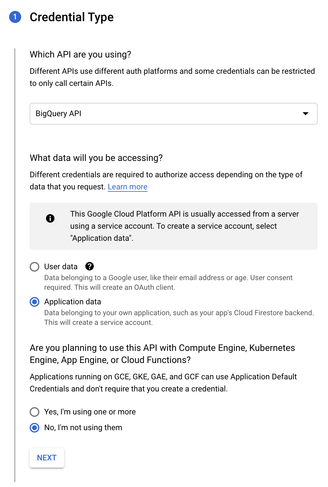
Options for setting up service account in GCP from the Credentials Wizard.
Next, follow the prompts to create a new service account. When giving the new service account roles, make sure to add BigQuery Admin as a minimum (you can add as many others as you like). In addition, you can add yourself to the Service account users role and Service account admin role if you'd ever like to impersonate this service account in the future. Once your service account is created, navigate to the list of service accounts, select the newly created service account, navigate to the Keys tab, and use the ADD KEY button to create a new JSON key.
Watch out!
Your newly generated JSON key file will download immediately. Since this file allows unmitigated access to (some of) your cloud resources, make sure to store it somewhere securely and do not check it into version control. If you're unsure of where to put the file, a good starting spot is /etc/keys/.
Next, let's install the BigQuery extension for pandas so we can execute queries programmatically. I'm assuming your environment is still set up from above (if not, make sure to reactivate your virtual environment). Back in your local terminal, use Pip to install it.
python -m pip install pandas-gbq
Phew, done with the boring stuff - let's get back to the code. Now we're finally ready to code up our application to interact with the Hacker News BigQuery dataset.
Our final product
First, let's set up our Dash app to use everything we've covered so far. We'll also need to use the Google Cloud SDK for Python to authenticate as our newly created service account in BigQuery. Here's what the app setup looks like. For brevity, I've omitted dash.dependencies.Input and dash.dependencies.Output because we won't be using any callbacks in this section. Callbacks are core to Dash's application structure, and I hope to cover them more in the future. For now, if you'd like to learn more about callbacks in Dash, check out the documentation.
import dash
import dash_table as dt
import dash_core_components as dcc
import dash_html_components as html
import plotly.express as px

import pandas as pd
from pandas.io import gbq

external_stylesheets = ['https://codepen.io/chriddyp/pen/bWLwgP.css']
app = dash.Dash(__name__, external_stylesheets=external_stylesheets)
Next, let's set up our app to execute BigQuery queries. We'll use the google.oauth2.service_account module and the newly created JSON key file you downloaded from GCP.
from google.oauth2 import service_account
credentials = service_account.Credentials.from_service_account_file('/path/to/your/keyfile.json')
Now, let's create some actual queries. I'm going to use two queries from Felipe Hoffa's Analyzing Hacker News Jupyter notebook to get started. Note that BigQuery prefers Standard SQL over Legacy SQL, so we'll have to make a couple minor changes. Let's put our queries in a dictionary so they're easier to reference.
queries = {
    'top_types': 'SELECT type, COUNT(*) count FROM hacker_news_copy.full_201510 GROUP BY 1 ORDER BY 2 LIMIT 100',
    'counts': '''
        SELECT a.month month, stories, comments, comment_authors, story_authors
        FROM (
            SELECT FORMAT_TIMESTAMP('%Y-%m', time_ts) month, COUNT(*) stories, COUNT(DISTINCT author) story_authors
            FROM hacker_news_copy.stories
            GROUP BY 1
        ) a
        JOIN (
            SELECT FORMAT_TIMESTAMP('%Y-%m', time_ts) month, COUNT(*) comments, COUNT(DISTINCT author) comment_authors
            FROM hacker_news_copy.comments
            GROUP BY 1
        ) b
        ON a.month=b.month
        ORDER BY 1
    '''
}
Now, let's loop through these queries and create pandas dataframes for generating Plotly figures. Make sure to replace <PROJECTNAME> with your project's name in GCP.
dfs = {}
for query_name in queries:
    df = gbq.read_gbq(queries[query_name], project_id='<PROJECTNAME>', credentials=credentials)
    dfs[query_name] = df
Finally, let's make some visuals! The first query top_types is just a simple report on the quantities in our data. We can put that in a simple, non-interactive table with Dash using dash_table. This should have already been installed when we installed Dash.
import dash_table as dt
table_label = html.Label("Hacker News BigQuery Public Dataset")
table = dt.DataTable(
    id='top_types-table',
    columns=[{'name': i, 'id': i} for i in dfs['top_types'].columns],
    data=dfs['top_types'].to_dict('records'),
    style_cell={'textAlign': 'left'},
    style_data={
        'whiteSpace': 'normal',
        'height': 'auto'
    },
    fill_width=False
)
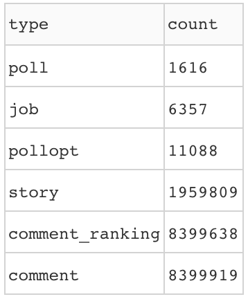
Our table from the top_types query.
Next, let's make some interactive graphs for our second query, counts. We'll make an animated histogram and a standard line chart. For the histogram, we'll need to restructure our data somewhat so Plotly can interpret it. Let's make a copy of our dataframe at dfs['counts'] so we don't modify it for future figures.
df = dfs['counts'].copy(deep=True)
df.set_index('month', inplace=True)
df = df.unstack().reset_index()
df.columns = ['category', 'month', 'value']
fig = px.bar(
    df,
    x='category',
    y='value',
    color='category',
    animation_frame='month',
    range_y=[0,df['value'].max()*1.1],
    title='Hacker News interactions over time, animated'
)
histogram = dcc.Graph(id='counts-histogram', figure=fig)
First, we set the index to the month column, as that's what our animation will track. Next, we pivot our data around our index (month), previous column names, and the original values using pandas.DataFrame.unstack(), and then rename the new columns appropriately. Finally, we build a figure using our newly restructured data.
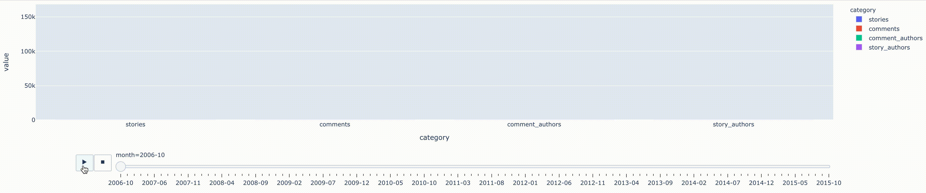
Our animated histogram from the counts query.
For the line chart, we'll need to add 4 separate traces, one for each of the dataframe's columns: comments, stories, comment_authors, and story_authors. To get more granular control of Plotly, we'll use the actual Figure class from plotly.graph_objects.
import plotly.graph_objects as go
fig = go.Figure()
for category in ['stories', 'comments', 'comment_authors', 'story_authors']:
    fig.add_trace(go.Scatter(
        x=dfs['counts']['month'], y=dfs['counts'][category],
        mode='lines+markers',
        name=category
    ))
fig.update_layout(title='Hacker News interactions over time')
line = dcc.Graph(id='counts-line', figure=fig)
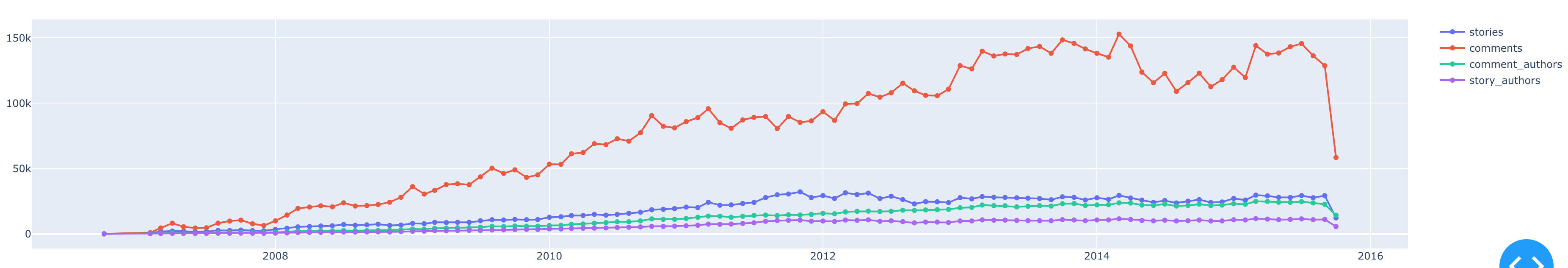
Our line chart from the counts query.
Finally, to display all of our generated visuals with Dash, let's add our figures to our layout and serve the application.
app.layout = html.Div([
    table_label,
    table,
    histogram,
    line
])

if __name__ == '__main__':
    app.run_server(debug=True)
Conclusion
Whew, you made it to the end! I know this was a lengthy post, but I hope it was well worth it. All of the code from this post is available in this repository in case you'd like to fiddle with it yourself. I'm hoping this will be the first of more Dash posts to come, as Dash and Plotly are very powerful for building interactive and visually-pleasing web apps. We're only scratching the surface of what Dash and Plotly are able to do. If you'd like to learn more, the Plotly Express documentation is a great way to get started. Dash is also available in R and Julia if that's more your speed. In the spirit of learning, here is a Stack Overflow question I asked while updating this article. I'm far from the perfect software developer and am always learning myself.
🦉
Artwork by Brushinkin paintings